Different Types of Chart
Introduction
AITable's chart widget provides you with diverse chart types to visualize data in different cases.This article may give you some tips on how to pick the chart more suitable for you.
Column chart
Regular column chart
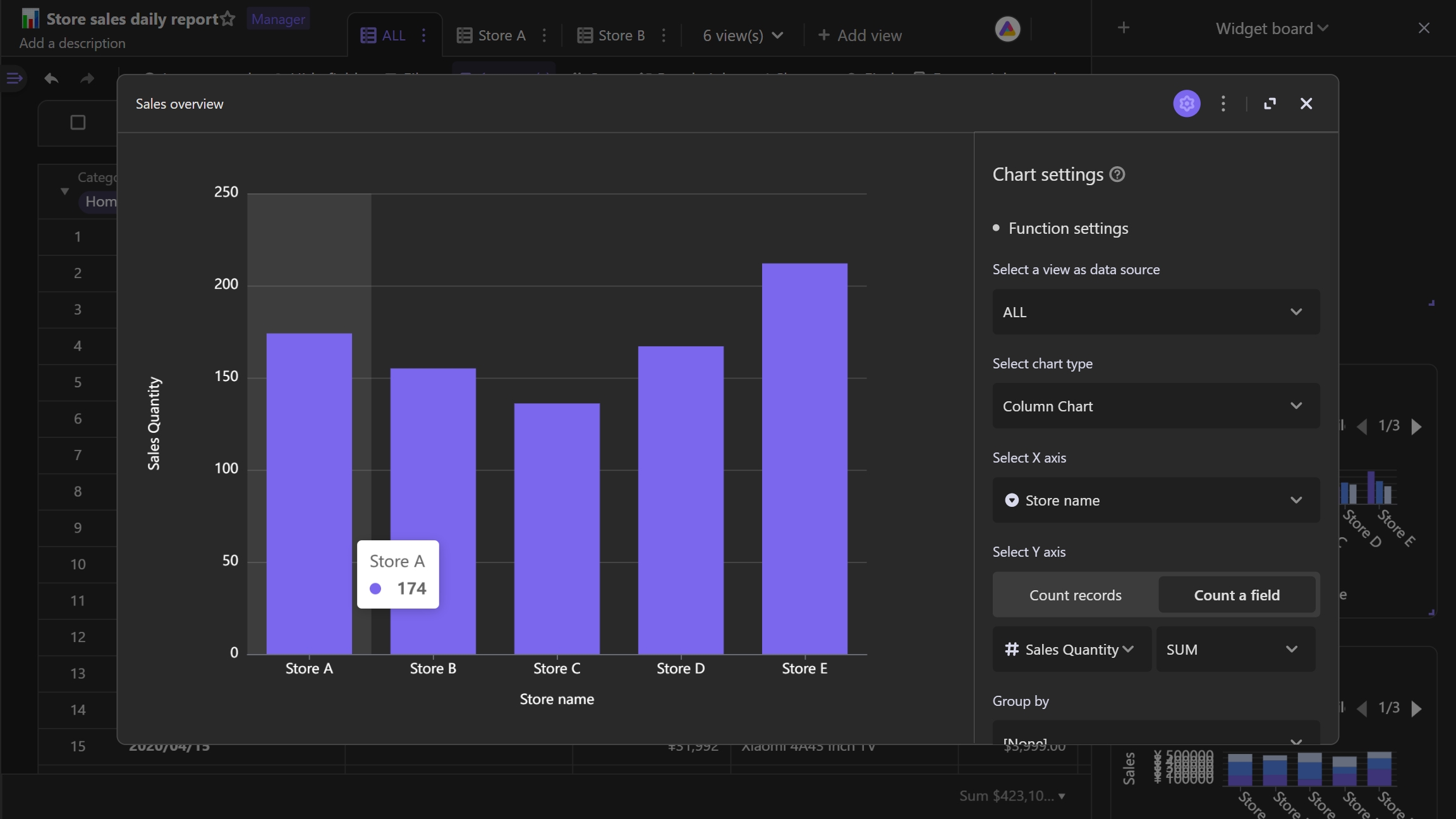
A column chart is a vertical bar chart. It uses rectangle bars with different size to represent the differences of values on X axis.
Here is an example use case. As the chart shown below, we can use column chart to compare the sales data of several stores. It's easy for us to conclude store E is sales champion by using the column chart.
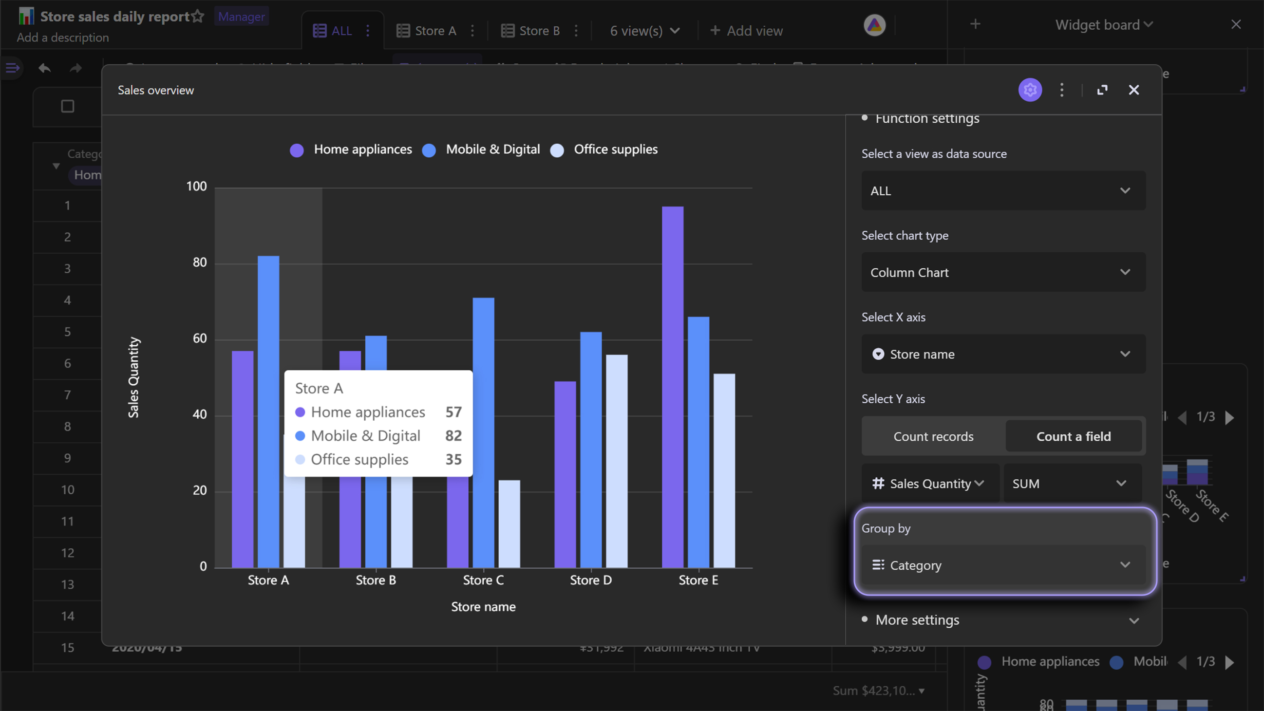
You can also group your records by a third field, which will introduce more separate subgroups onto you chart.
Taking below chart as an example, by grouping each store's data, we can see the sales data of different product categories, so that we could know what the bestsellers are.
Stack column chart
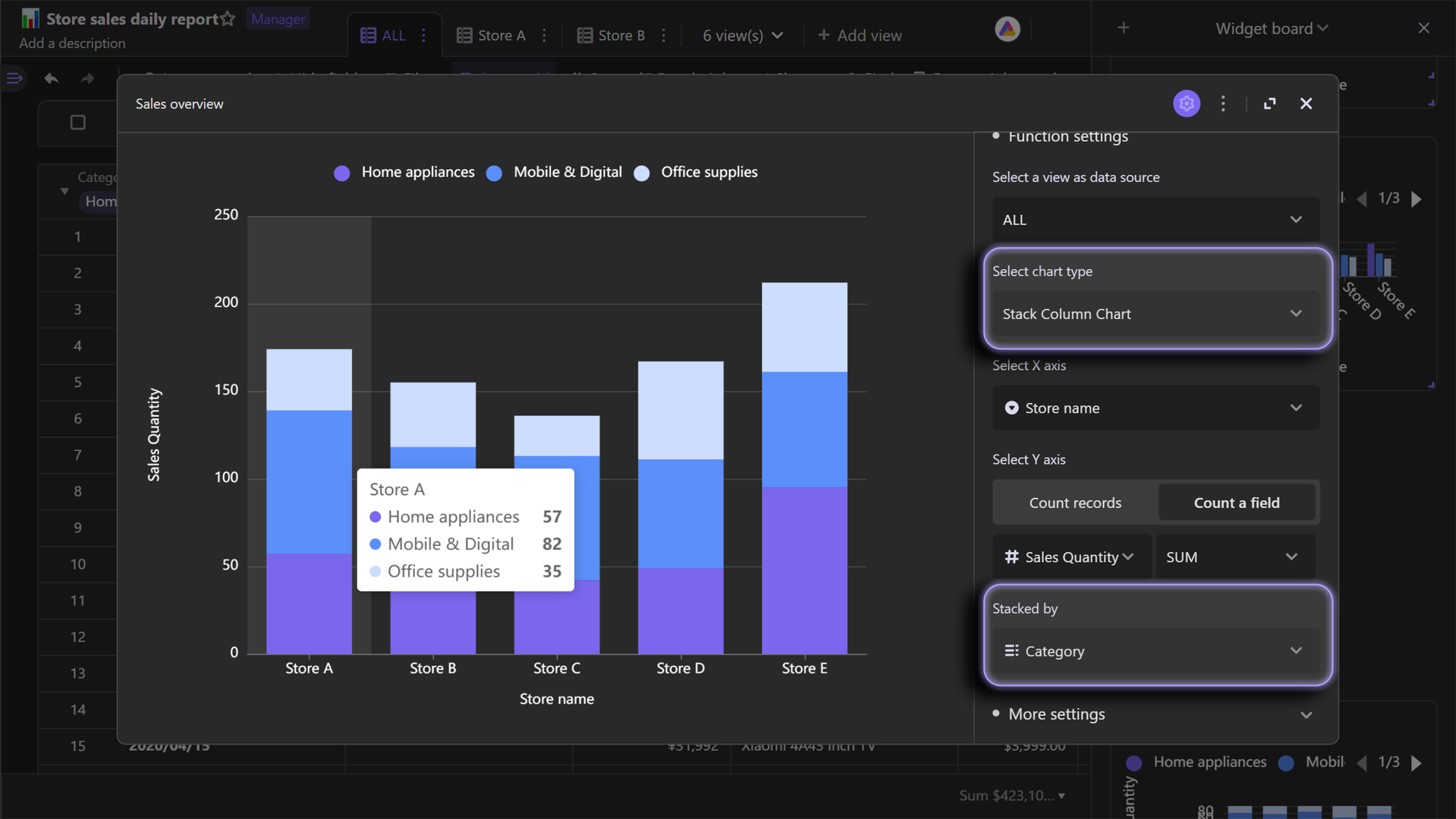
Stack column chart is an extension chart of column chart, which stacks the different groups on top of each other. You can use stack chart to visualize the difference of the groups.
Following stack column chart shows a use case for you. If you want to compare the total sales of the stores and the sales of different product categories in each store, just use stacked column chart.
Percent stack column chart
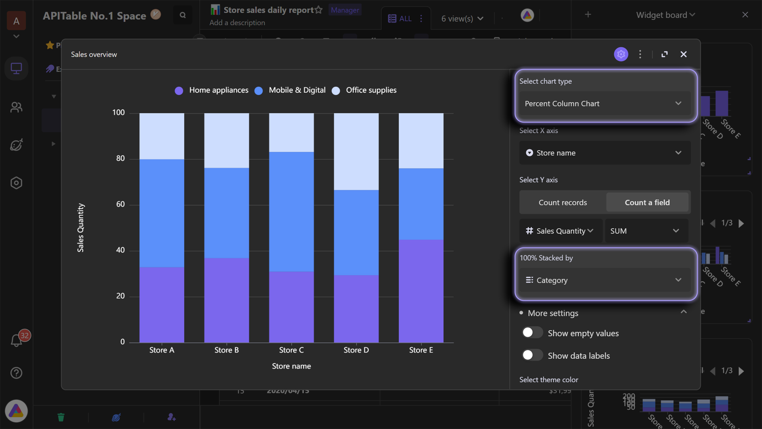
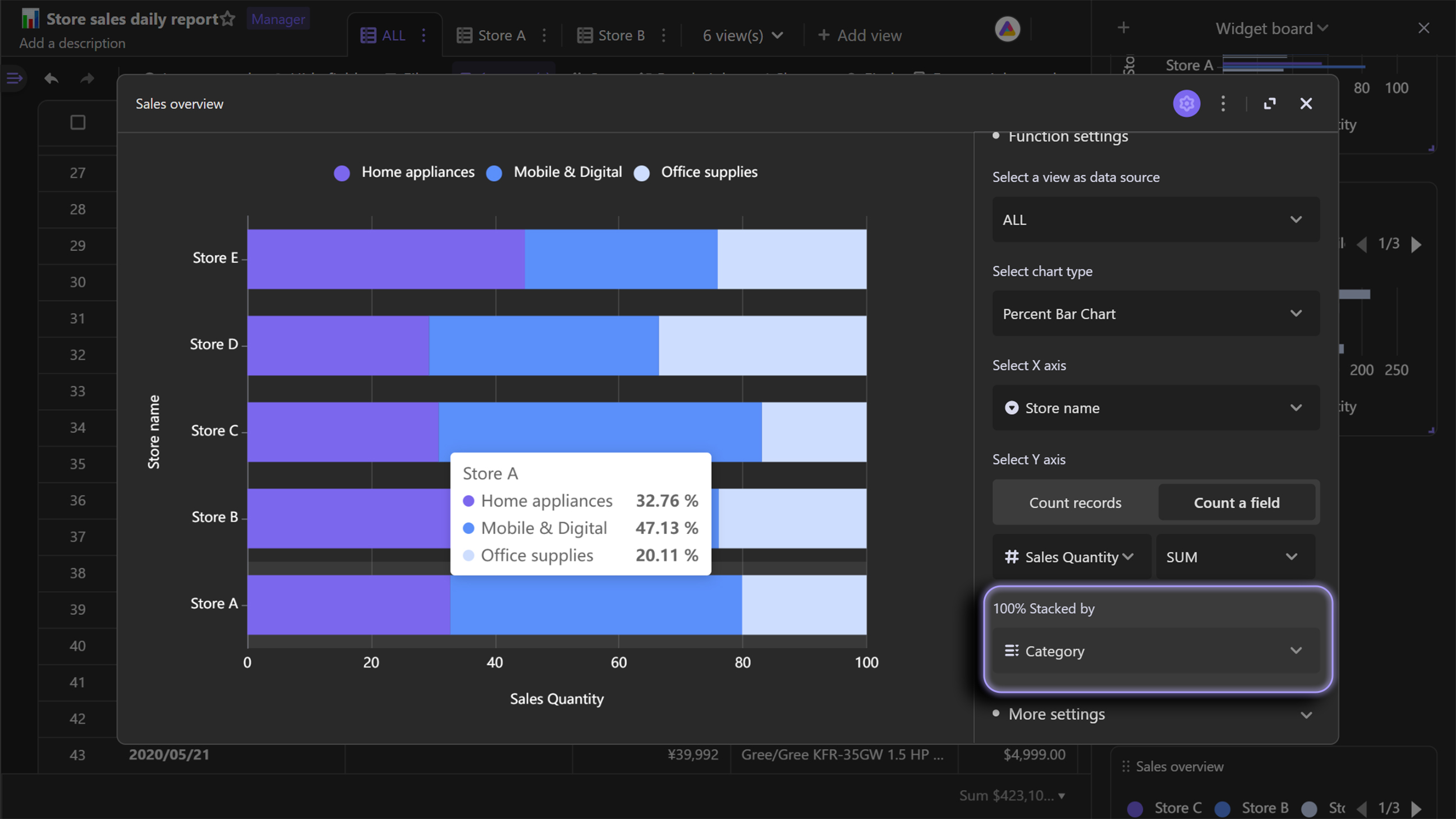
Percent stack column chart is an extension of regular stack chart. Compared with regular stack chart, percent stack chart displays the proportions rather than exact quantities of the groups.
Unlike the case of using stack column chart, if you don't care about the comparison of the stores' total sales, but would like to know how much different product categories contribute to the sales in each store, you can use the percentage stacked column chart.
The value range of percent stack column chart's Y axis is 0 to 1, which means 0% to 100%.
Bar chart
Regular bar chart
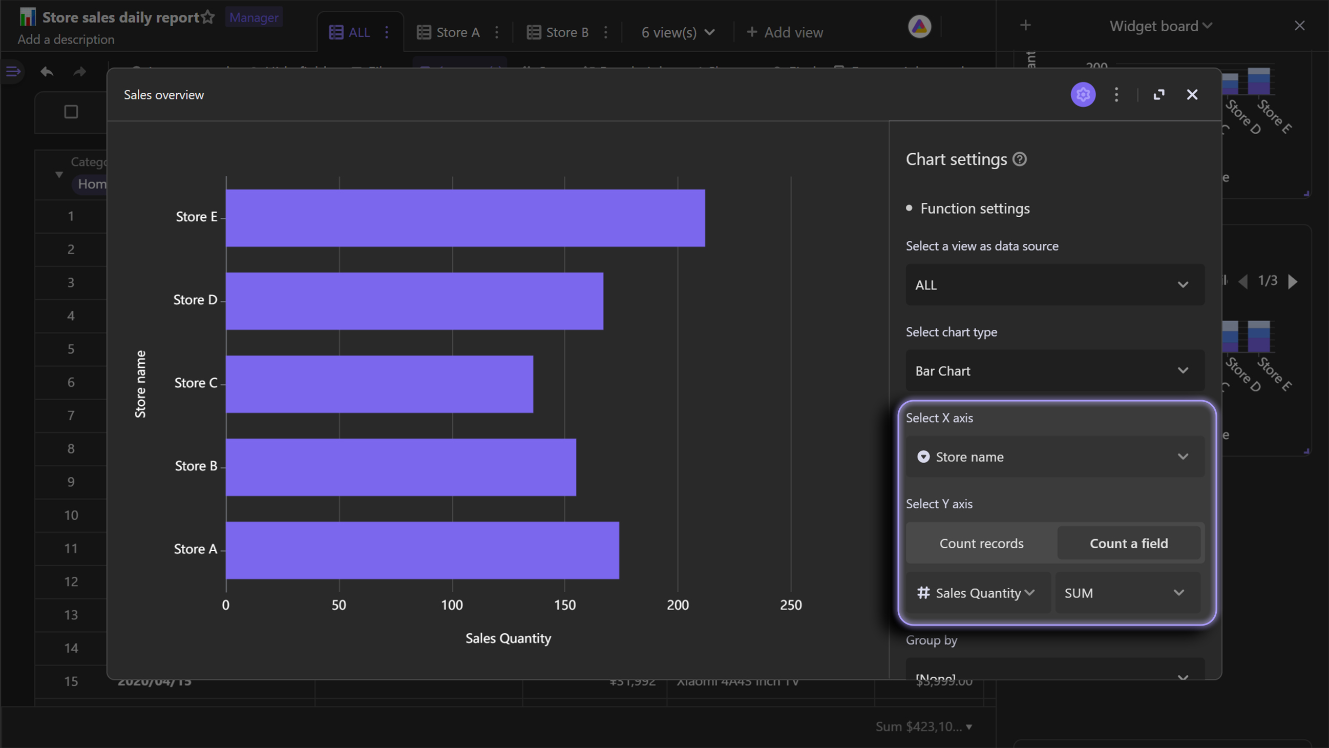
In short, bar chart is horizontal column chart.
Compared with the column chart shown above, X and Y axes are transposed on bar chart. Compared with using column chart, it is more clear to distinguish the differences between values when using bar chart.
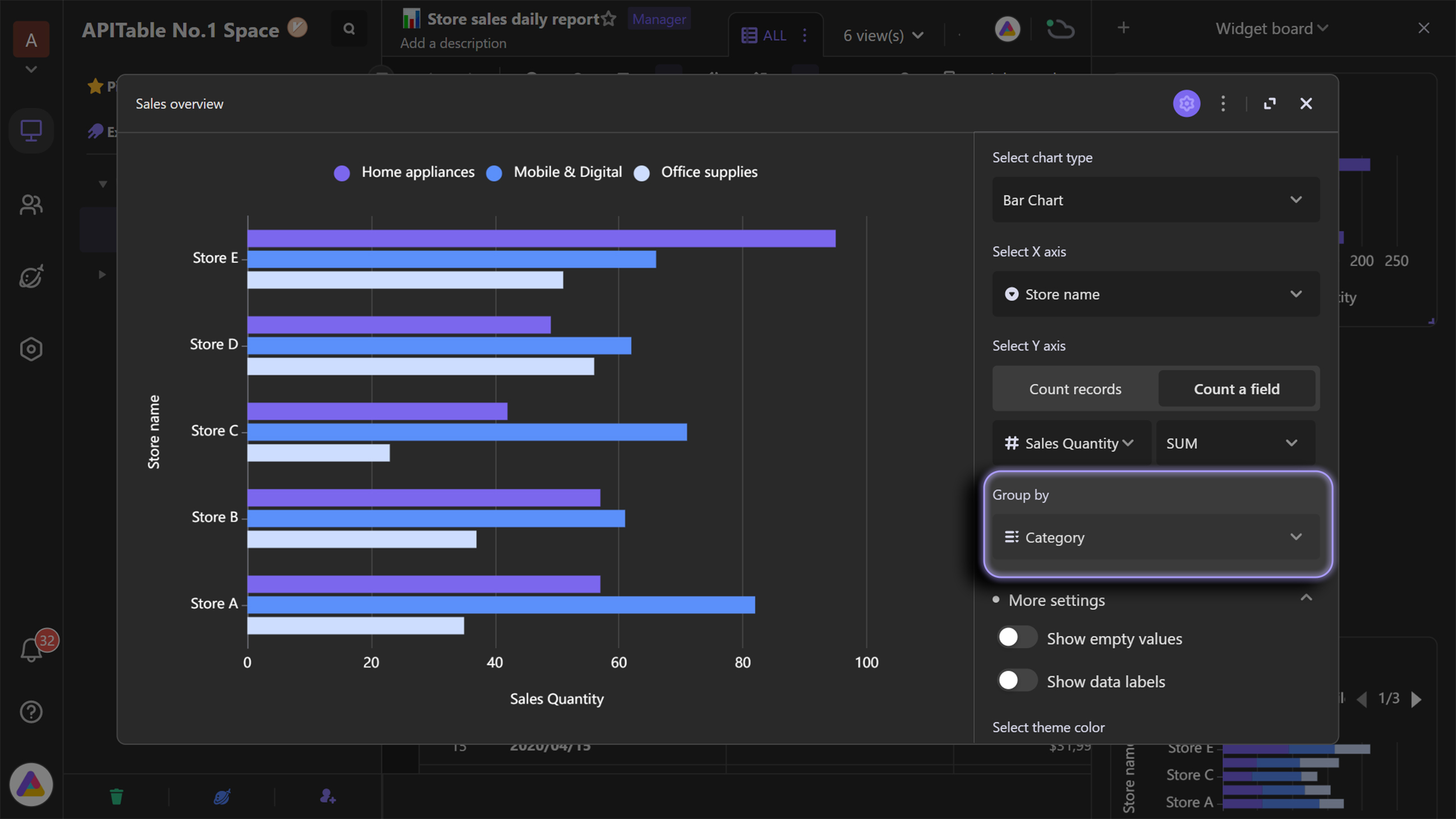
Similar to column chart, you can choose to group by a third field on bar chart.
Stack bar chart
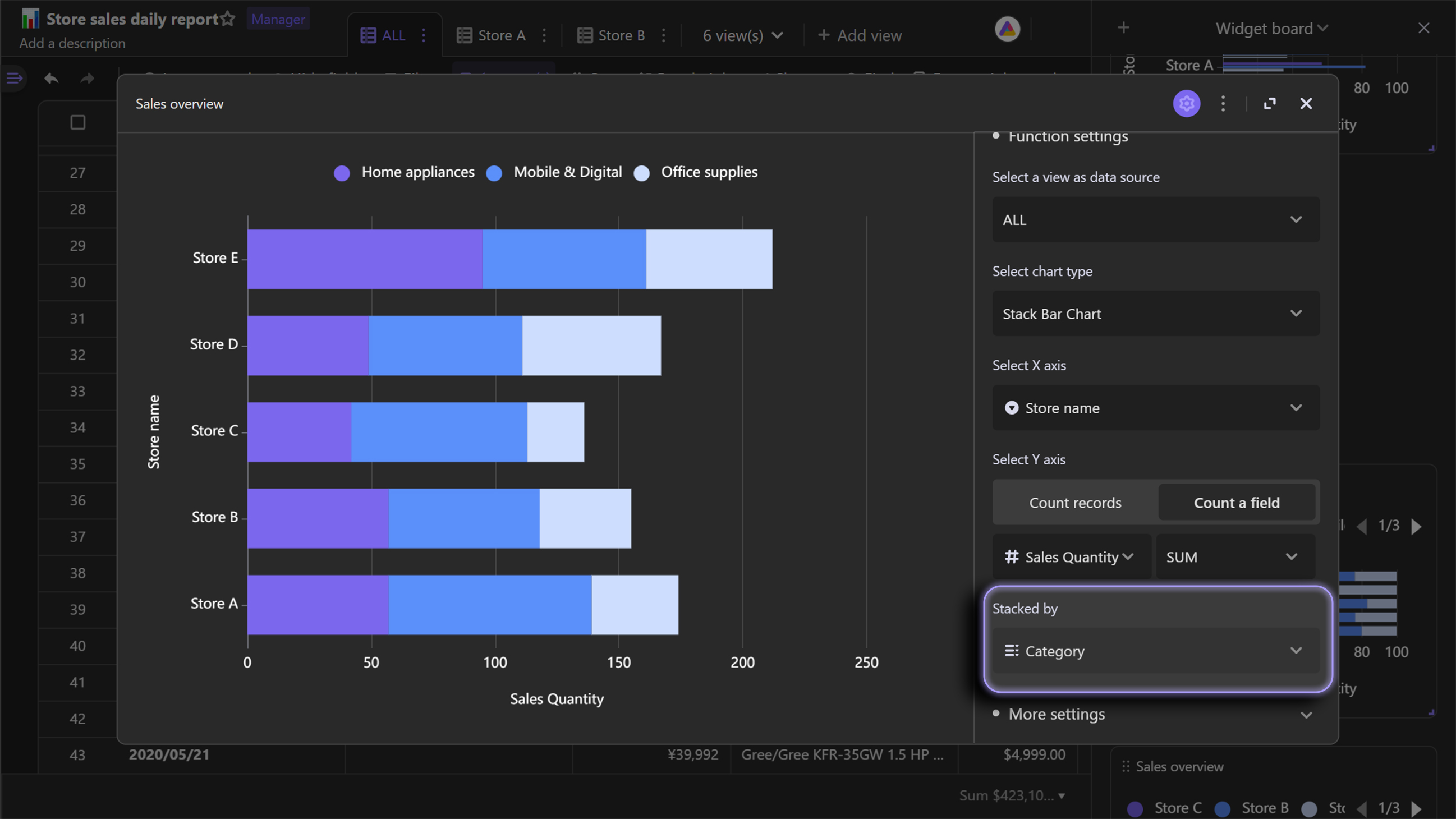
Stack bar chart is an extension chart of bar chart, which horizontally stacks the different groups on right of each other.
As below example bar chart shows, bar chart is useful for comparing the differences of different stores' as well as product categories' sales.
Percent stack bar chart
Similarly, percent stack bar chart is an extension of regular stack chart. Moreover, it's a result of transposition of X and Y axes on percent stack column chart.
Pie chart
Regular pie chart
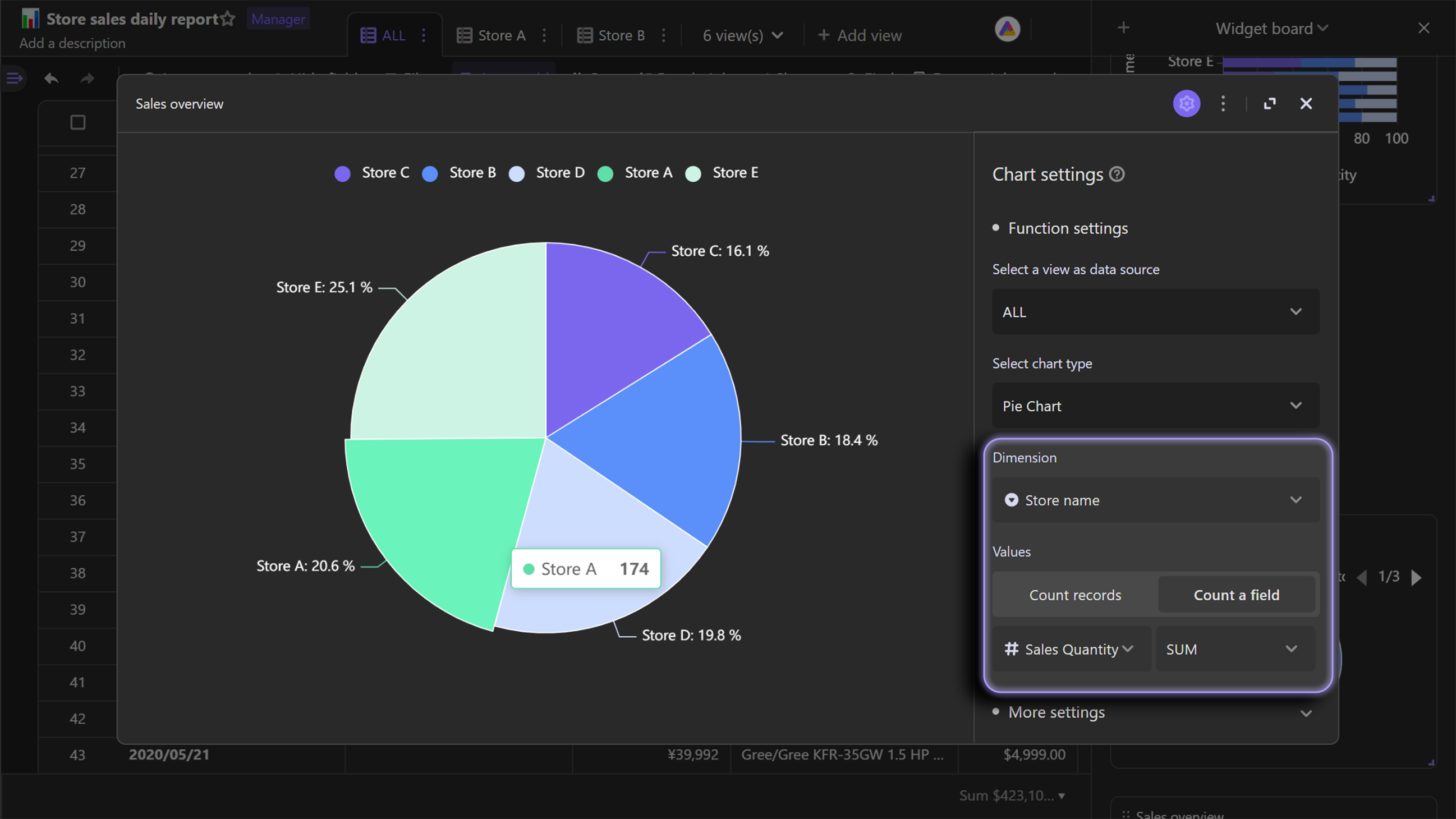
Pie chart displays subsets of the data and their relative proportions, with using arc lengths of the pie slices. The longer the arc length, the bigger the subset's proportion is.
In the case of organizing stores' sales, pie chart is an ideal chart type for comparing the sales proportions.Compared with column chart and bar chart, pie chart is more useful for highlighting the proportional relationship of data subsets.
Donut chart
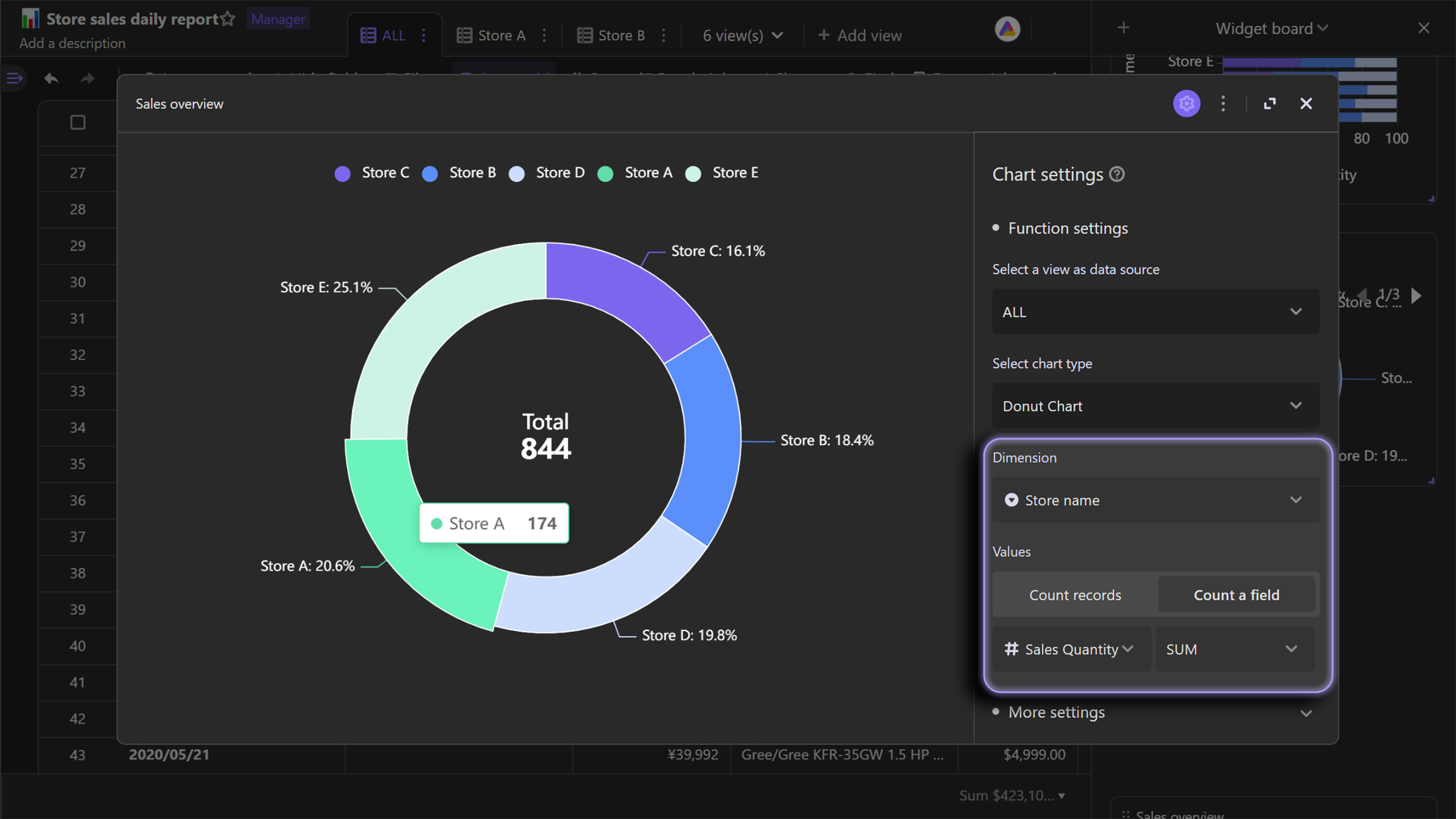
A donut chart is similar to a pie chart, but with a hole in the middle.
In the case of managing stores' sales data, donut chart shows the total sales at the hole position, making overall data clearer.
Line chart
Regular line chart
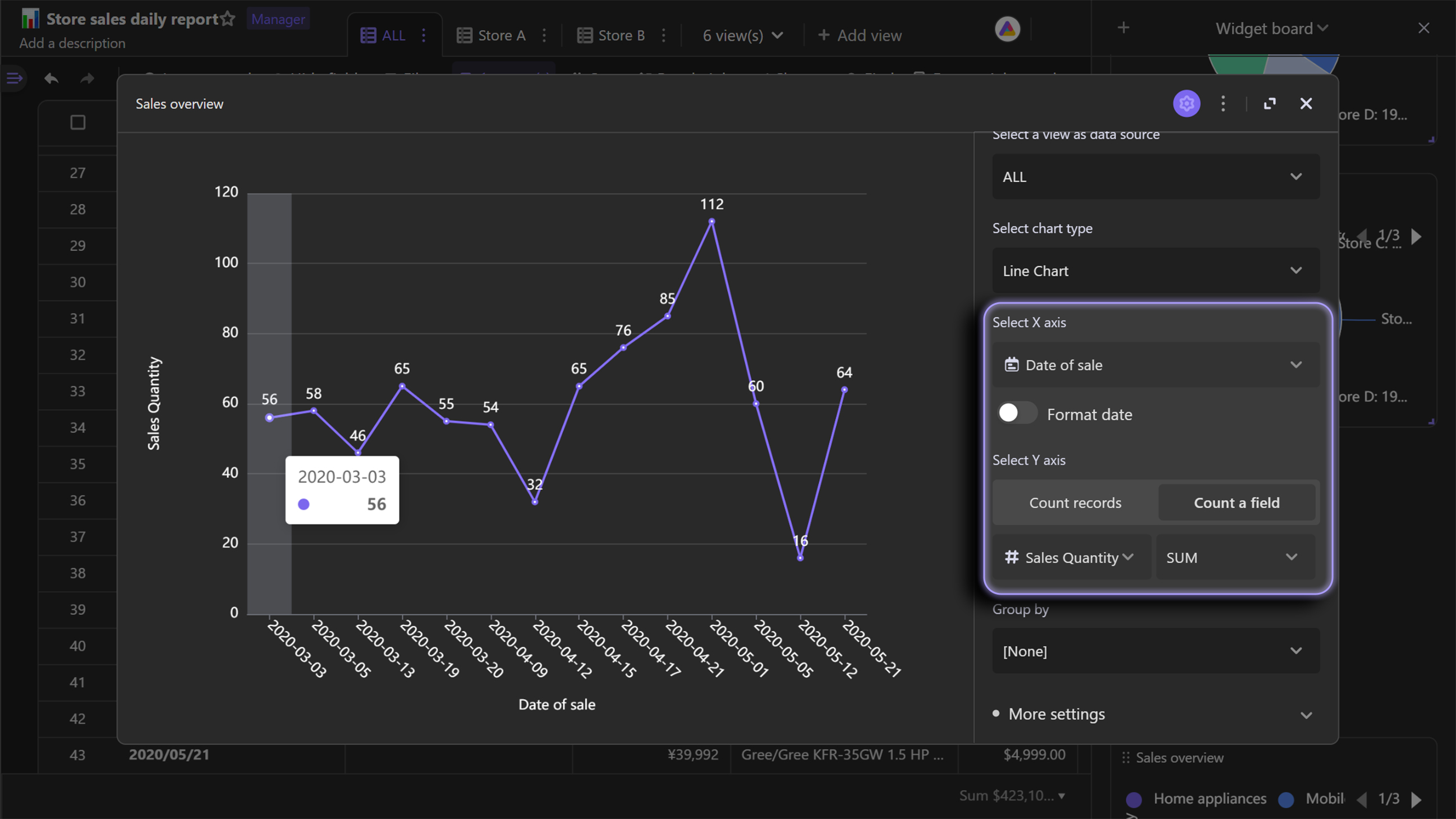
A line chart connects data points with straight lines. It is suitable for tracking data changes over a certain period of time.
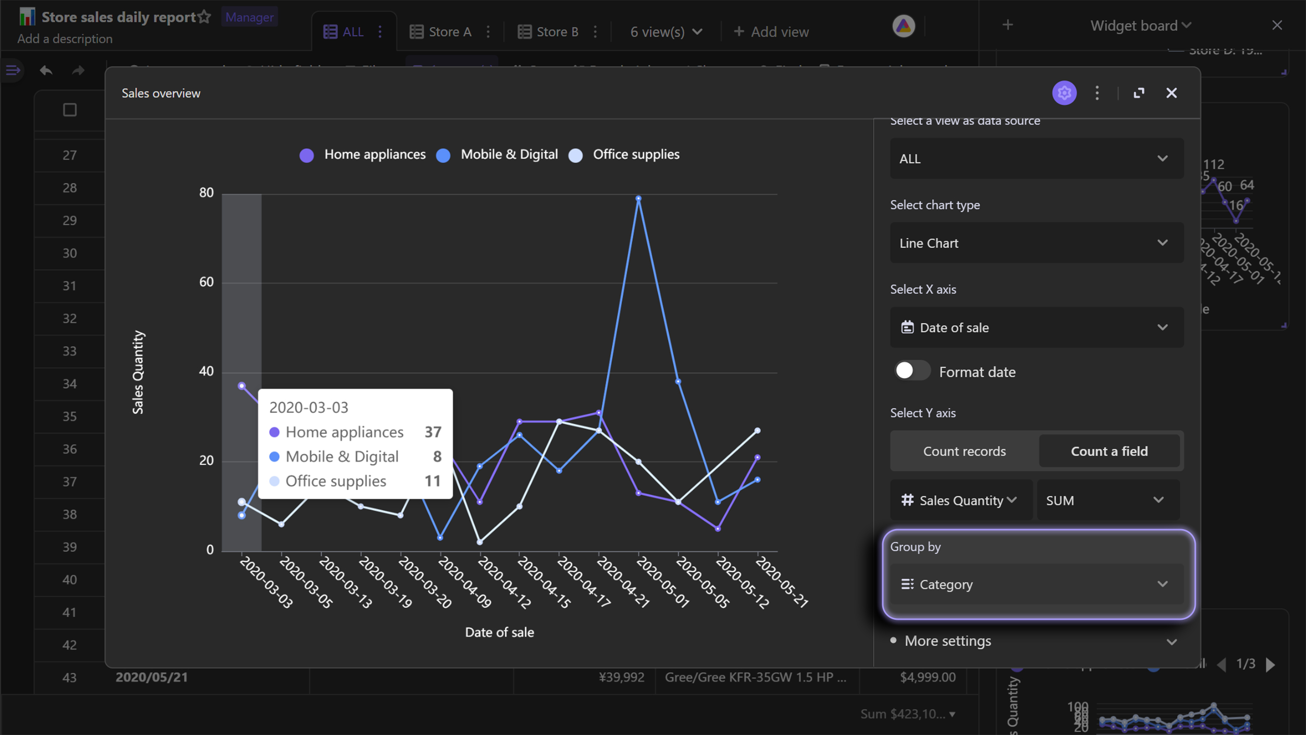
Here is an example of using line chart below. A line chart is used to know when the sales grew up and dropped.
The grouping function can also be applied to line chart.
In short, the grouping function can split one line into multiple lines, which is convenient for you to compare different subsets' data changes.
Stack line chart
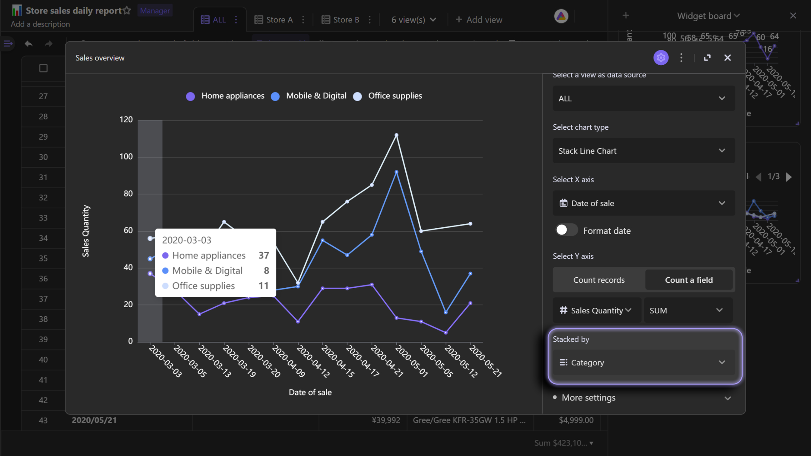
Stack line chart is an extension chart of regular line chart, on which lines are displayed one by one without overlap. By using line chart, you can also compare the difference of subgroups.
Like the following stack line chart shows, we could use it to track sales change of different categories over time, and compare the differences of those changes.
Scatter chart
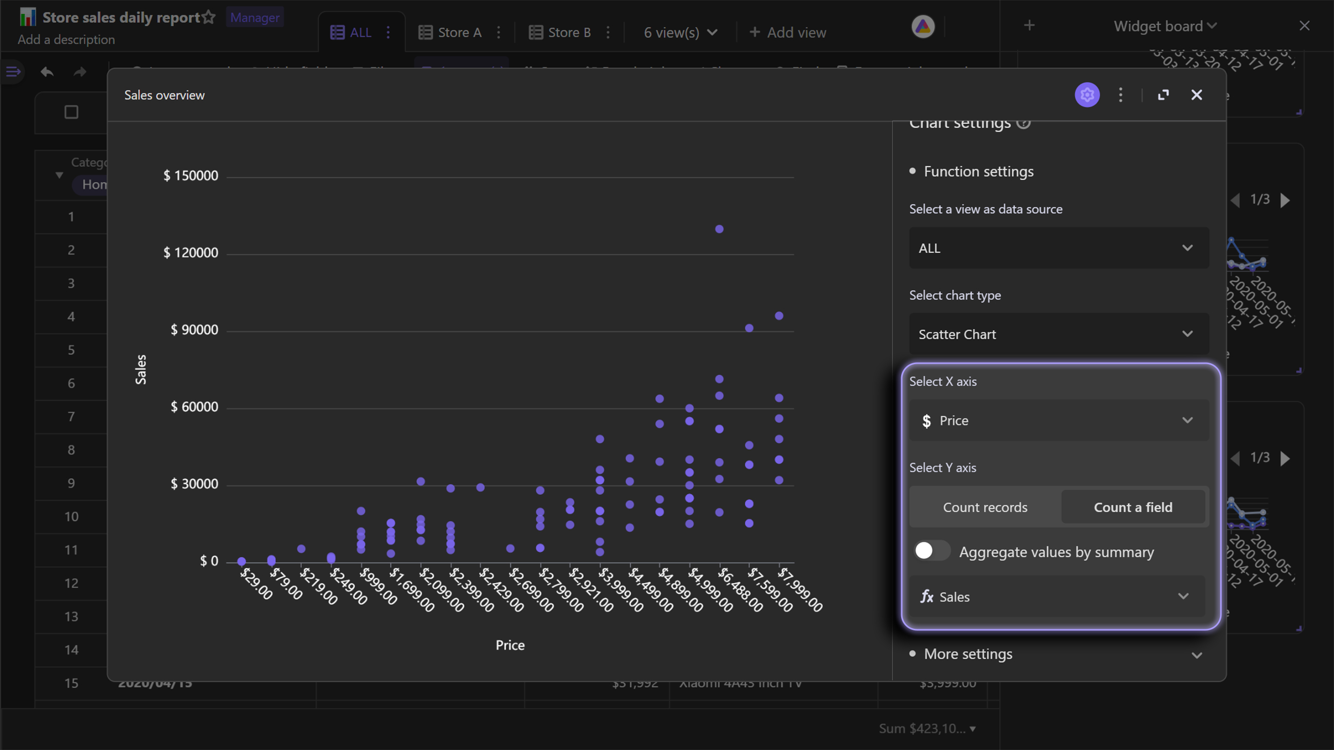
Scatter chart displays data as points on the chart. You can use scatter chart to learn if there is any connection between changes of X variables and Y axis variables.It is usually used in cases where both X and Y variables are numerical. In addition, it also displays distribution of dataset.
We can take the case of managing stores' sales as an example again. By using below scatter chart, we can see as the prices of the product increases, the total sales of each order increases.If the amount of data is sufficient, it's able to conclude that there is a linear relationship between "Price" and "Sales".
