✍️ Summary
- Revamped User Experience: Switch Between "Explorer" and "Pin" with Ease
- Revolutionize Your Data Analysis with Enhanced Filtering Capability in AITable widgets!
1. Revamped User Experience: Switch Between "Explorer" and "Pin" with Ease
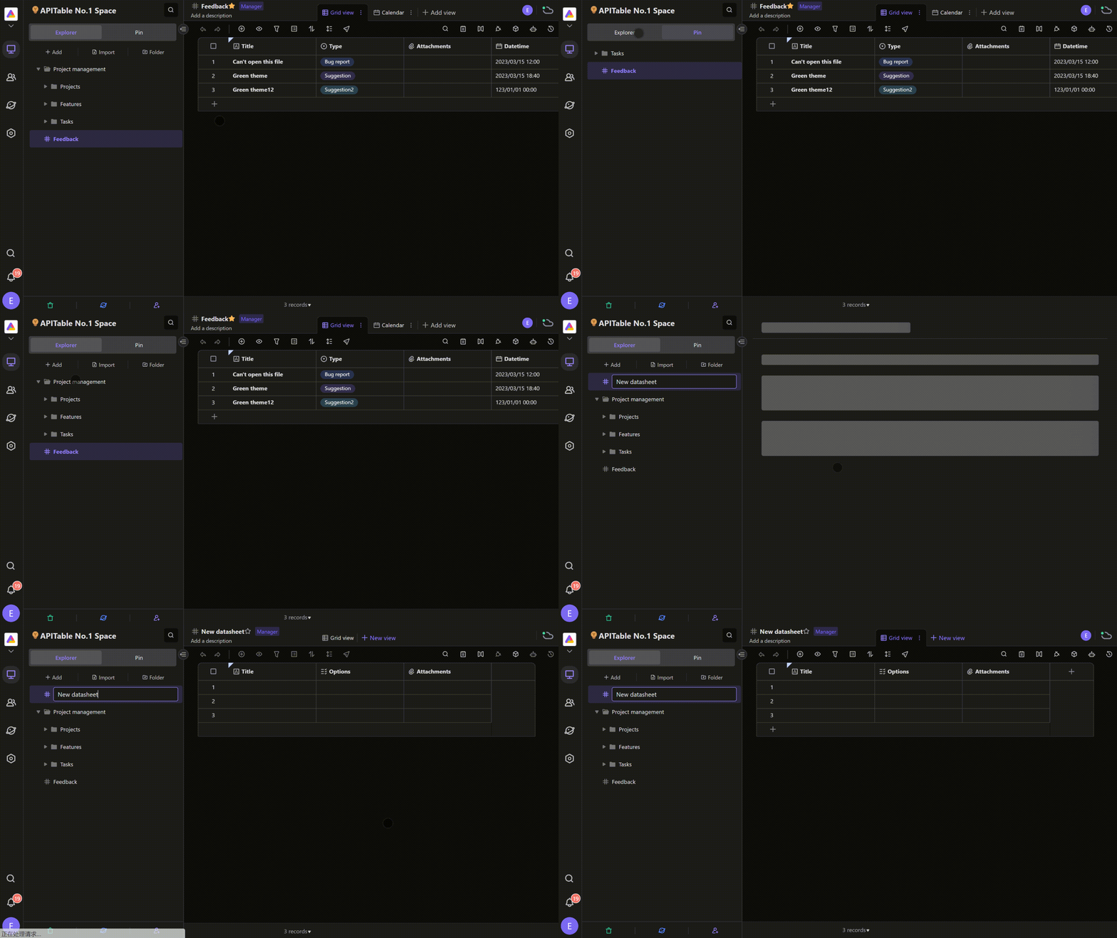
In the old version, the "Explorer" and "Pin" areas were stacked on top of each other, resulting in limited visibility due to screen height constraints. This meant that users had to scroll through the area multiple times when browsing and searching for files.
But with our latest upgrade, we've transformed the "Explorer" and "Pin" areas into a sleek left-right tab design. You can now easily switch between the two areas by clicking on the tabs, giving you more screen real estate to find what you need faster and more efficiently than ever before!

And that's not all! We've also added three commonly used buttons - Add, Import, and Folder - at the top of the "Explorer" area, making it even easier to manage your files.
Our small but mighty update will truly transform the way you work. So why wait? Try it out now and experience the difference for yourself!
2. Revolutionize Your Data Analysis with Enhanced Filtering Capability in AITable widgets!
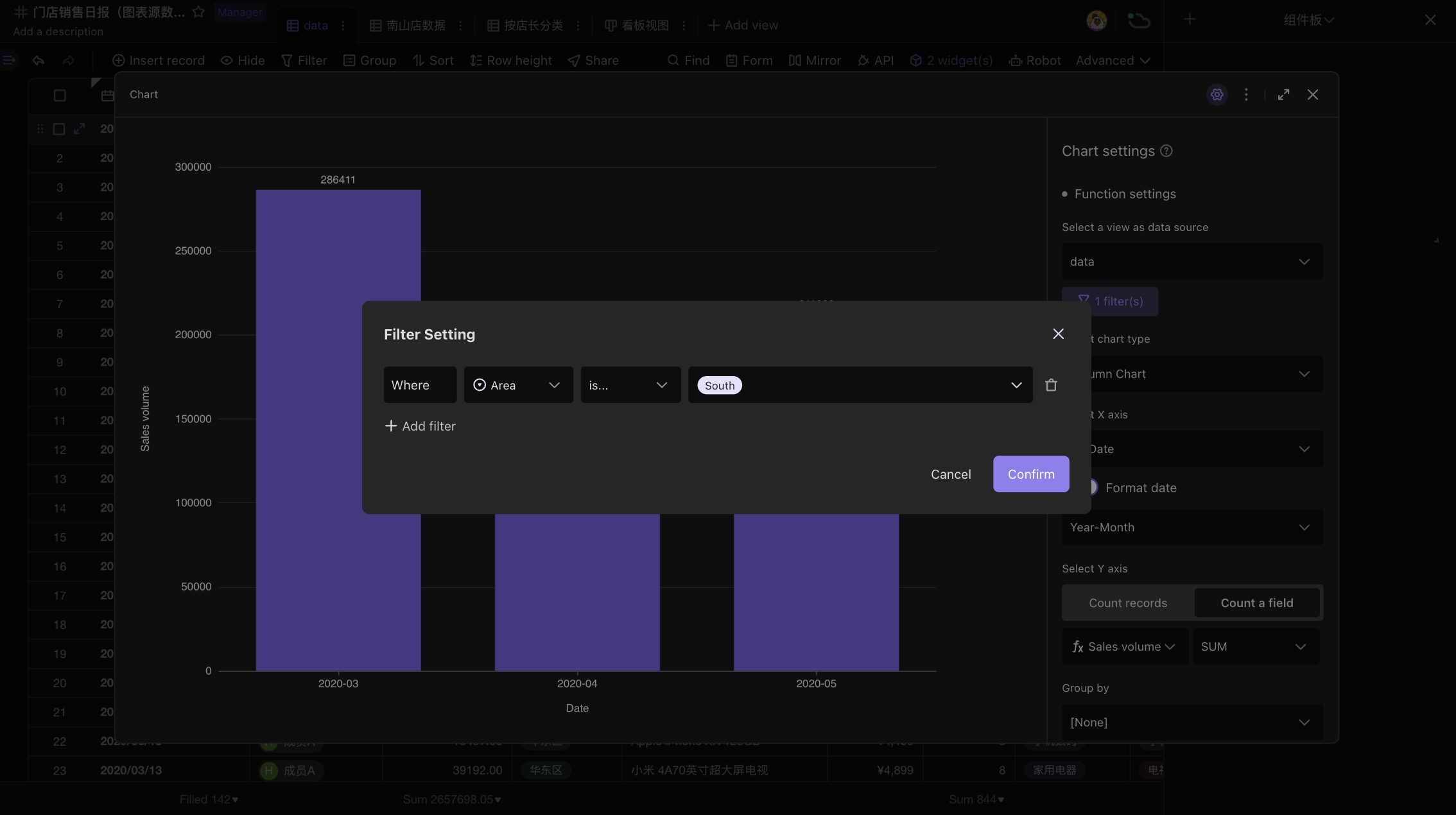
Our widgets, such as charts and pivot tables, have been upgraded to support setting filtering conditions within the widget itself.

Previously, if you wanted to filter out irrelevant data, you would have to create a new view in the datasheet and use the view filtering feature, resulting in too many views.
Now, our upgrade lets you set filtering conditions for records within each chart widget without creating redundant views in the datasheet. This not only makes data analysis simpler but also prevents team members from getting in each other's way when collaborating.
